

Better AWS Architecture Diagrams: Video-On-Demand Service

Amazon Web Services (AWS) provides a vast library of solutions to everyday business problems. In this series, we critique the architecture diagrams included in these solutions and attempt to expand and improve on them.
This article has been updated to include new perspectives.
Below is AWS’s architecture diagram for their Video-On-Demand service featuring AWS Elemental solution. It comes directly from the linked guide. While the guide itself is excellent, the architecture diagram is not very useful.
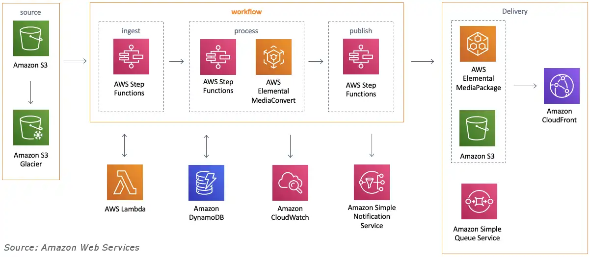
As a technical resource, this diagram has a number of obvious problems:
- The purpose of this diagram is neither clear nor explicitly stated anywhere. In the solution docs, it is simply referred to as the “environment” or the “architecture” of the system. We can only try to infer its purpose (see below).
- The solution’s resources aren’t actually named in the diagram. Instead, only AWS services (e.g. “AWS Lambda”) are displayed.
- The arrows are unlabeled, leaving the viewer to guess as to the nature of the relations between resources.
Together, these issues make the diagram vague to the point that it is practically useless as a technical document. It gives an impression of what is going on in the solution, but lacks specifics engineers would find valuable. If this diagram was given to a new hire, they’d probably feel pretty lost.
Of course, this diagram would be perfectly fine if it were used only as a decorative element in a blog post or a presentation. Given that it is part of technical documentation, however, I believe it needs to be better. In this article we will improve this diagram to make it valuable for documentation purposes. We will do so by improving the precision of both the diagram’s goal and its contents. We start with the former:
First, what is the goal of this diagram?
By goal, I mean the answer to the question “what is this diagram trying to say?” As mentioned previously, it isn’t explicitly stated. However, based on the information that is in the diagram, plus a careful reading of the solution text, CloudFormation template, and accompanying code, the goal of this diagram can be inferred.
As it turns out, there are actually two goals for this diagram. The first goal is to show the dependencies between the resources. The second is to show how data flows between them. Rather than try to accomplish both goals in a single diagram, we will break the diagram up into multiple perspectives.
Perspective 1: Resource Dependency
Goal: Show which resources depend on which resources
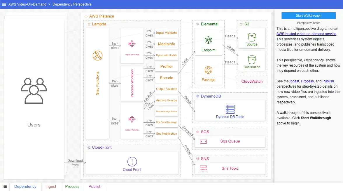
In this perspective, we indicate a dependency by drawing an arrow between the dependent and independent resources. Dependent resources appear on the left, while independent resources appear on the right. The value of this should be pretty clear. If, for instance, the DynamoDB table (called, regrettably, Dynamo DB Table in the solution) were to somehow stop functioning, this perspective would allow us to assess the impact by tracing backwards and finding the affected resources:
Unlike the original, this perspective shows the actual resource names, not merely service names. This is most obvious in the Lambda section in the middle, where state machines and Lambda functions are referred to by name (note that some of the resource names in this solution - e.g. Package, Endpoint, Dynamo DB Table - are not very good, unfortunately). Giving the dependencies (arrows) themselves names (in the form of labels) also adds precision and clarity. Lastly, integrated notes, on the right, help orient the viewer.
This perspective is an example of a static or invariant perspective. The information contained in this diagram does not have steps; the relations defined between the resources are continuously true. What this perspective doesn’t show is the dynamic interactions between the resources as data flows through the system. Rather than try to express this in this perspective, we instead create new perspectives to show them.
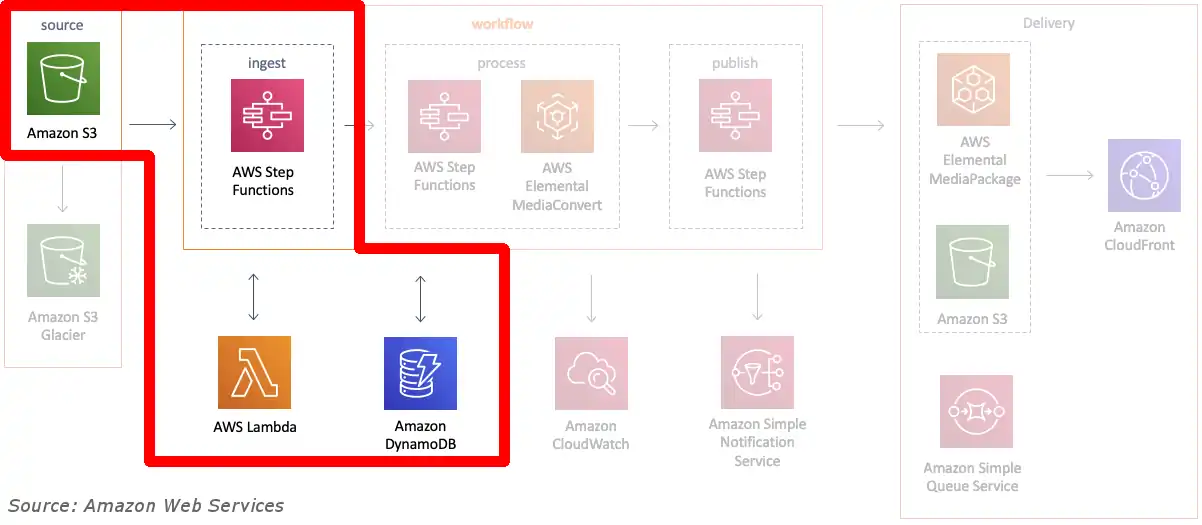
Perspective 2: Ingest Flow
Goal: Show how video is ingested into the system
The second goal of the original diagram (reprinted here) is to show how data flows through the system while it ingests media. We can infer a few things from it:
- Data starts somewhere in S3
- It travels through AWS Step Functions to resources in the AWS Elemental service
- Data ends up in CloudFront and in S3
- Lambda, DynamoDB, CloudWatch, SNS, and SQS are all involved in some way
This is all, to be blunt, hand-wavy and imprecise. Worse still, it is also inaccurate. Data does not neatly flow from left-to-right in this system in a handful of steps. In reality, data flows back and forth between resources over dozens of steps. A flow diagram is the wrong tool to express this; instead, we will show data flow using a more sophisticated tool: sequence diagrams.
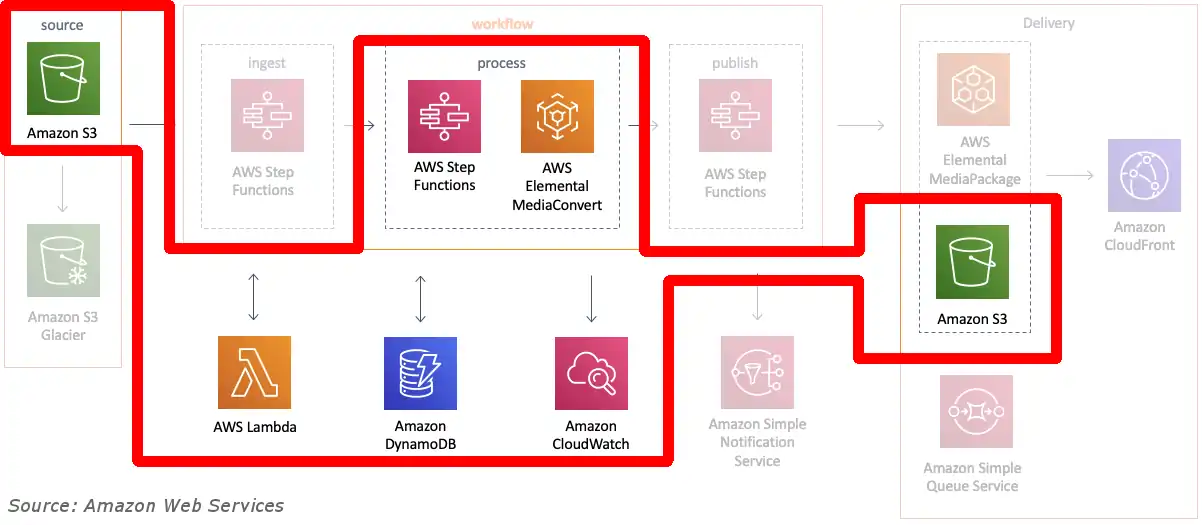
The entire ingest-processing-publishing workflow is a long one, so we break them up into three perspectives. The first, Ingest, corresponds to this section of the original:
Here is our updated version, expressed as a sequence diagram:
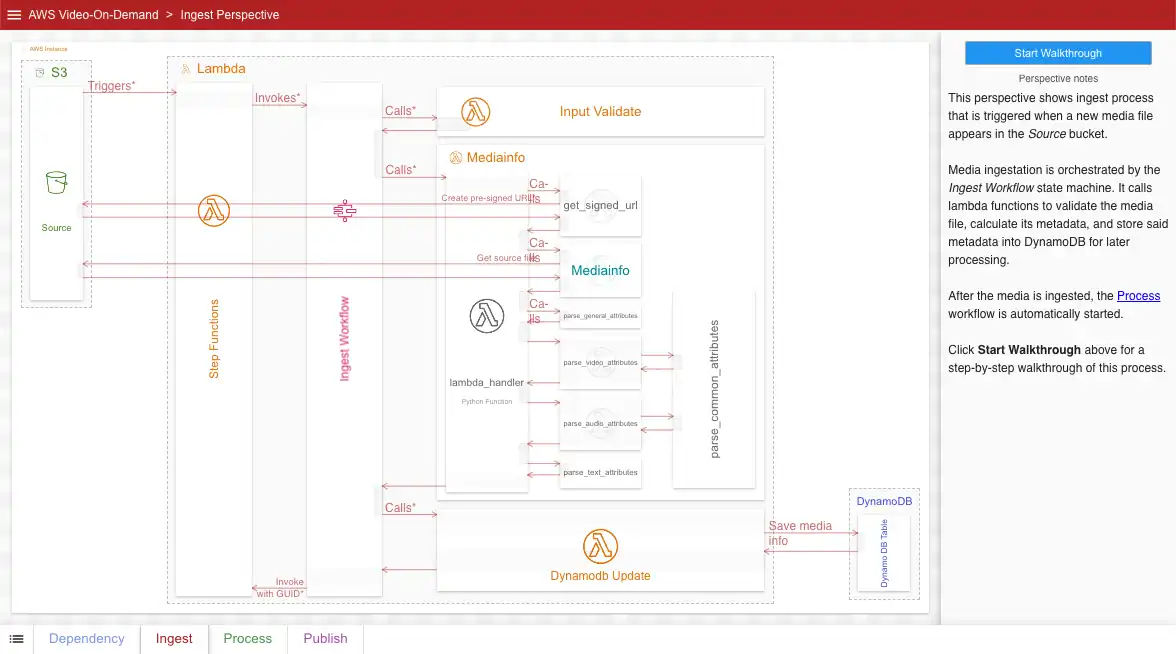
Right away, viewers of this diagram see that data doesn’t flow just in one direction, but back-and-forth between resources. Additionally, like in our first perspective, the viewer benefits from actual resource names, labeled arrows for each step, and integrated notes.
If your diagramming tool allows for it, expandable details allow your diagram to be both precise (our key goal) and readable at the same time:
As a sequence diagram, this perspective shows viewers when and how resources are used. The viewer sees which Lambda functions and Step Functions are called and in what order. They also see exactly when and how DynamoDB table(s) and S3 bucket(s) are used.
Perspective 3: Process Flow
Goal: Show how ingested video is processed
Our third perspective, Process, is also a sequence diagram. This one shows viewers the processing steps done after a video is ingested. It corresponds roughly to these portions of the original:
Updated:
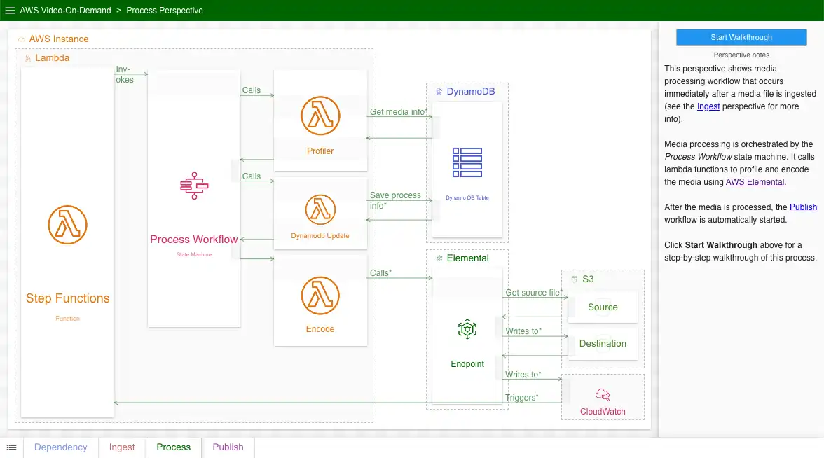
Like in the previous perspective, viewers see exactly which Lambda functions, DynamoDB tables, and S3 buckets are used and in what order. The arrows on the lables also shed further light on purpose behind each call. Viewers learn about the purpose behind two new resources: an Elemental endpoint and Cloudwatch.
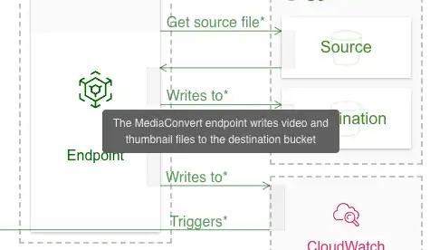
To include even more detail, we make use of pop-up information for each step (most diagramming tools allow for this). This gives a little more information about the data flow and makes the diagram just a little bit better:
Perspective 4: Publish Flow
Goal: Show how processed video is published
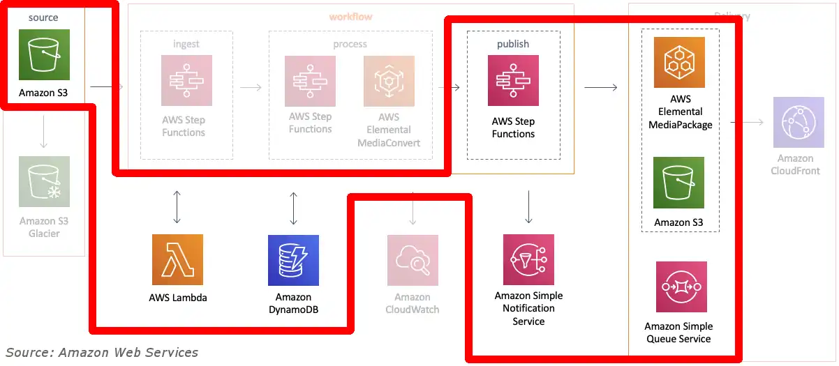
Our last perspective, Publish, shows how processed videos are published to end-users. Here is the original diagram with the relevant resources highlighted:
Updated:
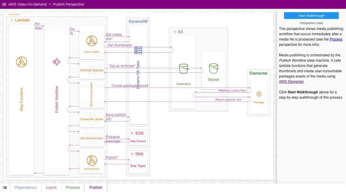
This perspective, like the previous two, includes much more process detail when compared to the original. Individual resources and the relations between them are properly labeled. Furthermore, viewers learn when, how, and why resources are accessed.
Conclusion
By splitting up the original AWS diagram into multiple perspectives (with distinct goals), explicitly labeling resources and relations, and adding more detail overall, we greatly improved the value of the diagram as a source of information. It can now reasonably be used as documentation in its own right. When making your own diagrams, be sure to adhere to the same principles we did:
- Always aim to truly inform your audience, not merely create an impression.
- Decide on the goal(s) before you begin. Split up your diagram into different perspectives, one for each goal.
- Use the proper type of diagram depending on what you are showing. Given the complexity of data flow, such diagrams should almost always be sequence diagrams.
- Use real resource names, not service type names. Let the resource’s icon serve as information about the service type instead.
- Label your arrows as much as possible.
If you haven’t already, click here to browse this diagram yourself. Questions or comments? Please reach out to me on LinkedIn or by email at billy@ilograph.com.