

7 Common Mistakes in Architecture Diagrams

When creating a technical architecture diagram, your goal is to give understanding to your audience. You want to honestly inform viewers about your system rather than merely make an impression. Mistakes made when creating diagrams can undermine this goal, however. Here are seven common mistakes to avoid when making technical architecture diagrams.
A follow-up is available here: 7 More Common Mistakes in Architecture Diagrams.
Mistake #1: Making a theoretical diagram
First, a definition: theoretical (or abstract) architecture diagrams demonstrate how a generic solution might look and run. Concrete diagrams, by contrast, show a specific instance of an architecture that enables (or will enable) specific applications for particular users.
Creating theoretical diagrams isn’t always a mistake, of course. That said, you probably don’t want to be making theoretical architecture diagrams most of the time. A concrete diagram of your organization’s specific architecture is almost certainly more informative and more valuable than a theoretical architecture diagram. Why?
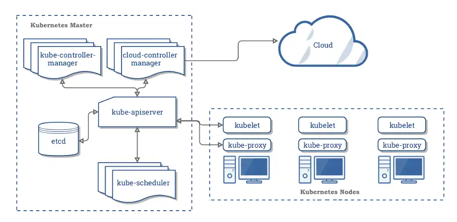
A theoretical Kubernetes architecture. Source: kubernetes.io
The reason is that theoretical architecture diagrams are ubiquitous. You can find theoretical diagrams of, for example, Kubernetes-based architectures everywhere online. Those already exist if a new hire needs a general lesson on Kubernetes. You don’t need to make another one.
Conversely, how many architecture diagrams show your organization’s specific architecture? How many show the named resources, their relations, where they run, and what applications they support? That’s the architecture diagram your new hire needs. Make that diagram instead.
#2: Mixing levels of abstraction
This sin is borrowed directly from programming, though it is just as applicable to diagramming. The mistake is having an architecture diagram that mixes high-level and low-level resources.
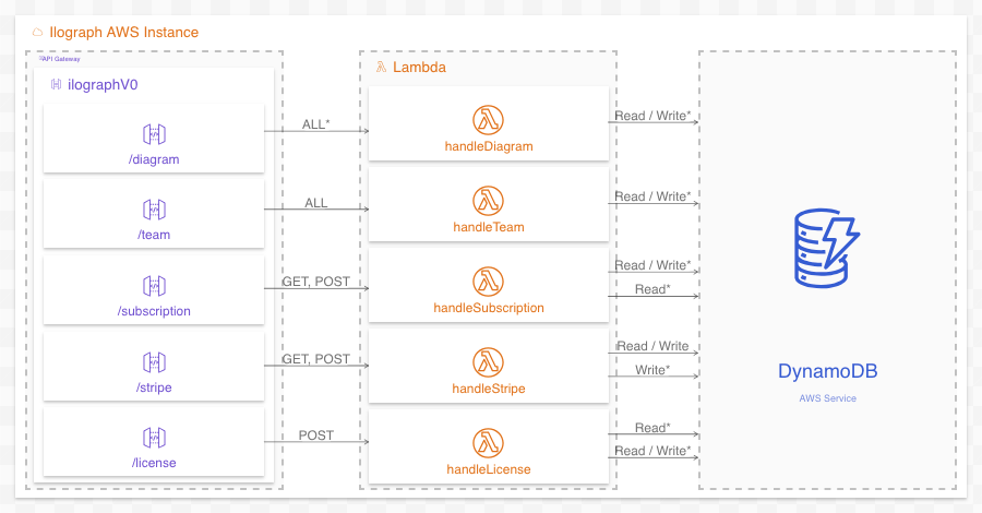
Problem: This diagram is mixing levels of abstraction (function -> database)
The diagram above directly links low-level resources (individual lambdas) to a high-level resource (DynamoDB, the AWS service). Showing only that these lambdas use DynamoDB is unbalanced and not very informative. It is much better to show which functions use which tables in the database since functions and tables exist at the same level of abstraction. With this change, we’re doing a better job of informing the viewer:
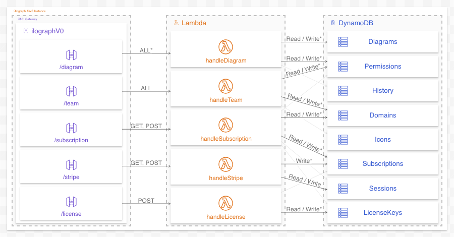
Fixed: Now only resources of the same level of abstraction are related (function -> table)
Both high- and low-level diagrams have their place, of course. If you’d like to have both, split them into two separate diagrams.
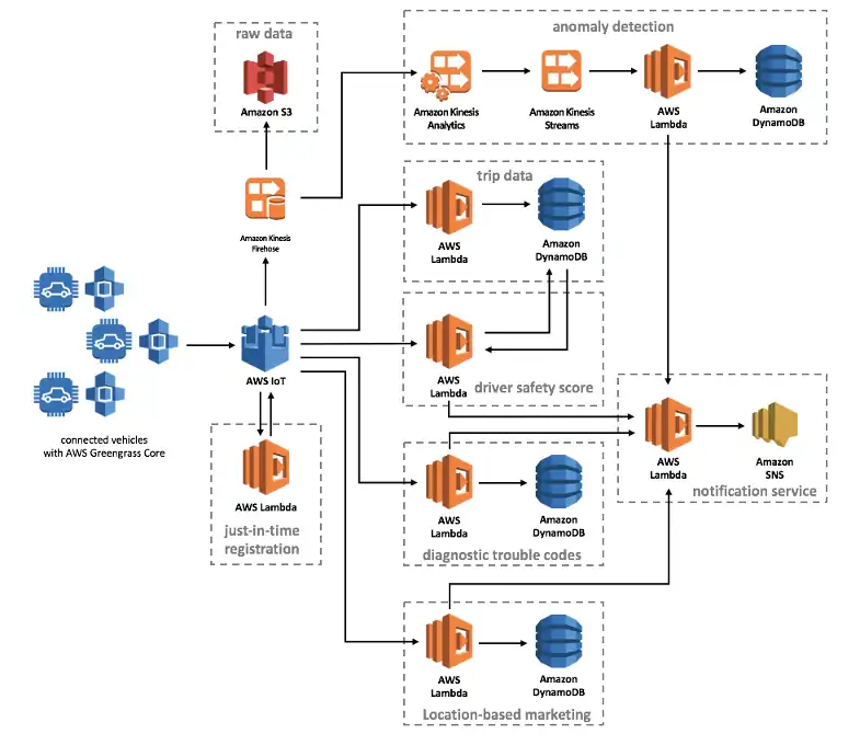
#3: Too many overlapping concerns
Busyness is a common problem in architecture diagrams. Diagram authors often have a lot to say and little space to say it. One of the most common kinds of busyness is simultaneously showing too many overlapping concerns.
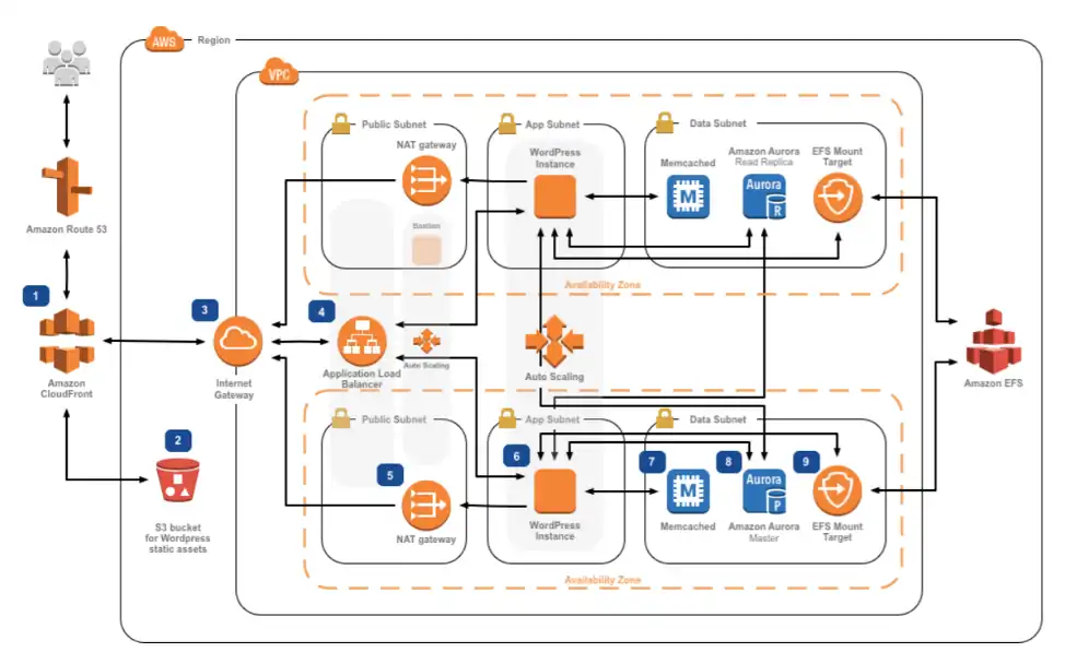
A diagram of many concerns. Source: amazon.com
The above example tells the story. While its abstraction is consistent, this architecture diagram includes resources, a region, a VPC, auto-scaling groups, subnets, and availability zones. The diagram is about how data flows between resources (hence all the arrows, though see the next item), but because it is so jam-packed with all these other concerns, the message is not strong. The auto-scaling groups, in particular, literally overlap everything else.
Like the previous problem (mixing levels of abstraction), the solution is to split up a busy diagram into multiple diagrams, each focused on one or two concerns at a time.
#4 Unlabeled arrows
This one is as straightforward as it is common: unlabeled arrows are almost always wrong. An unlabeled arrow tells the viewer that two resources are somehow related but not precisely how. Unlabaled arrows undeniably violate the “strive to honestly inform” principle.
It is not clear how, exactly, these resources are related. Source: amazon.com
Unlabeled arrows can be OK if viewers can infer the exact nature of the relation. One clear example is a series of arrows with the same label that are very close together; in this case, omitting the repeating labels is preferable (as it reduces visual noise). Unlabeled arrows are also acceptable when they overlap each other. In all other cases, though, if you have an arrow, it needs a label.
#5 Misleading composition
Every problem so far has been related to an architecture diagram providing too much, too little, or irrelevant information. This mistake, misleading composition, is a problem of providing information that can subtly mislead.
A misleading composition is best explained by example. Can you spot the misleading composition in this AWS diagram? Hint: Composition (boxes inside other boxes) shows what resources exist or run inside other resources.

Something isn’t quite accurate here…
The composition of this diagram tells the viewer that the Drupal Instances run inside two availability zones (AZ1 and AZ2). This is accurate; the problem is that the composition is also (erroneously) telling the viewer that the availability zones are running inside the VPC. AWS experts might know this is not the case, but novices might come away believing, wrongly, that availability zones are resources of a VPC.
One option is to omit the out-of-place resources (and potentially show them in another perspective). However, if we must show these resources in this perspective, it is preferable to at least draw them differently. A dashed outline, for example, gives a clue that the composition of these elements is different than the others:
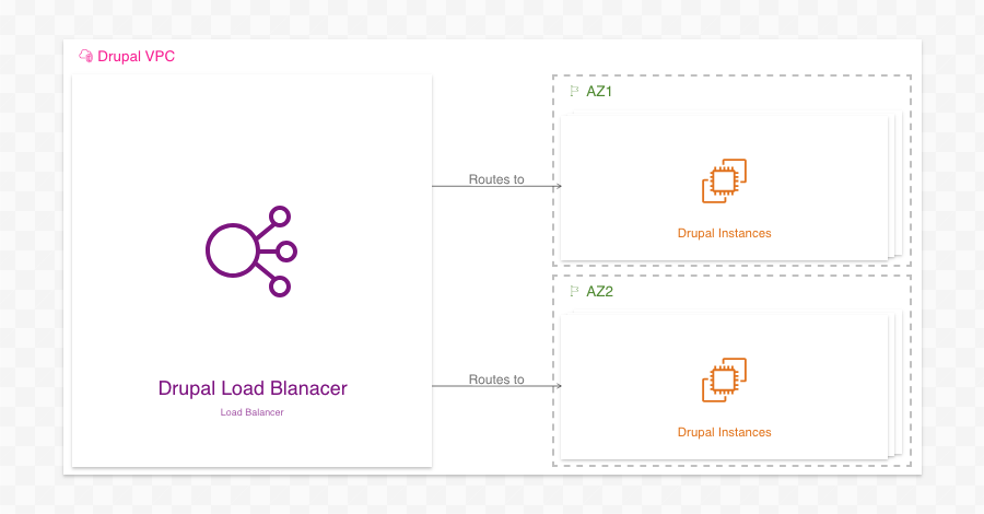
Fixed: While the Availability Zones are still drawn within the VPC, the dashed style indicates the composition is different than the others
#6 Missing context
Another potential solution to the above is to eschew composition altogether and provide no context to your resources. This omission is a mistake, however; while you may know where your resources live, you cannot count on every viewer knowing.

Where do all these resources live?
Including one or two levels of composition (though not to the point of showing too many concerns, see #3) provides both organization and essential contextual information to those who are new to your architecture:

#7 Missing accompanying explainer text
Finally, always remember that architecture diagrams can’t explain everything. In particular, though great at showing what, diagrams alone are unsuitable for explaining why. Include ample prose alongside your diagrams to introduce your architecture and highlight critical design choices and their reasoning.
Text alongside your diagram is critical for explaining what the diagram itself does not
Better still, if your tool supports it, add a walkthrough to your diagram to explain what happens (and why) at each step.
I hope this was helpful! Please reach out with your thoughts at billy@ilograph.com. For more information about Ilograph diagrams, check out the Ilograph homepage or see an example diagram.
Interested in more examples? Read 7 More Common Mistakes in Architecture Diagrams.