

Why Do We Create System Architecture Diagrams Anyway?

Building a working system is a big part of an engineer’s job. Just as important, if not more so, is documenting that system so others can understand, maintain, and expand it. That documentation can come in many forms, including source code, written documentation, and architecture diagrams. In this post, we’ll focus on system architecture diagrams, what they’re good at, and their role in the documentation landscape.
Wait – is source code really documentation?
Sure. In fact, source code is the ultimate source of truth of what a system does and how it does it. The detail level is effectively infinite; everything that can (reasonably) be understood about the system exists in the source code. Further, the source code cannot become out of date as easily as other forms of documentation.
On the downside, it is difficult to learn from source code. It takes considerable skill and experience to learn a system and its motivations from source code. It is very much all trees and no forest. And to a non-engineer, it is all but impenetrable.
Written documentation covers many of the deficiencies of source code. It can provide an accessible introduction to a system and its motivations. It is also highly versatile; unlike source code, system architects can use it for how-tos, decision records, and specifications.
So if source code is the ultimate source of truth, and written documentation is an accessible and versatile way to learn about a system, then where do architecture diagrams fit in? As it happens, diagrams fill a critical documentation gap for both novice and experienced engineers. We’ll explore this through an example diagram we’ll create step by step.
Part I: Resources, relations, and patterns
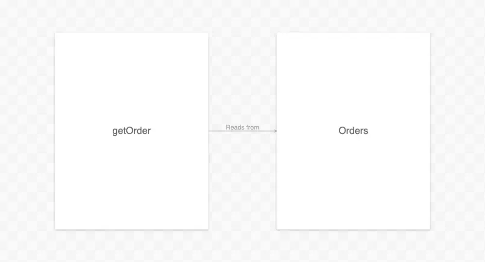
Let’s start with possibly the simplest diagram we could make:

I warned you it would be simple! If we were to translate this “diagram” into written documentation, it would probably be just “there exists a thing called getOrder.” Actually, the diagram subtly tells the viewer a little bit more. The box around getOrder tells us it is a discrete resource. Unlike indiscreet resources (such as time or goodwill), getOrder is a bounded entity that viewers can distinguish from the rest of the universe (the space outside the box).
You probably didn’t consciously think all of that when looking at the diagram. Still, it illustrates a fundamental benefit of visual diagrams: they naturally show relationships between discrete resources and their place in the universe. This benefit becomes clearer if we make our diagram just a bit more complex:
Now we have something that looks like a real diagram, albeit still simple. This diagram tells the viewer that Orders, like getOrder, is a discrete resource. It is distinct from getOrder and everything else in the universe. The arrow between the two indicates a relationship: getOrder “reads from” Orders. A translation of this diagram to prose would still be short: “There exist things called getOrder and Orders, and getOrder reads from Orders.”
But what are getOrder and Orders anyway? An experienced viewer could probably infer that getOrder is something functional, and Orders is a data store of some sort. If they knew the domain was cloud computing, they could even make a good guess at the exact types of these resources. But why leave it to chance?

With the addition of types, the viewer now knows the type of these resources, specifically a Lambda function and a DynamoDB table. To emphasize these types and generally brighten things up, we can add colors and icons:
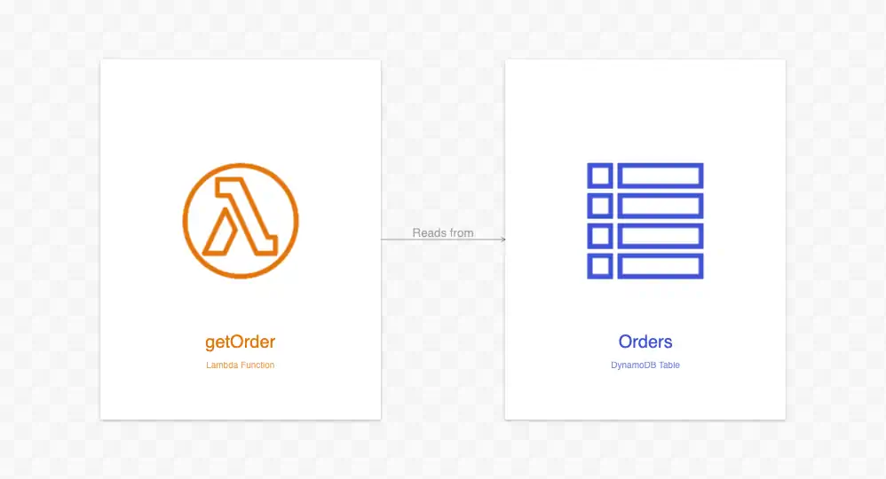
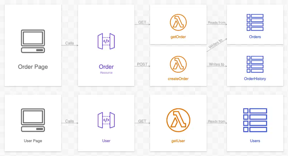
Much better, right? Even at a glance, the viewer learns these two resources are different types. This distinction becomes especially important as we add more resources to our diagram:
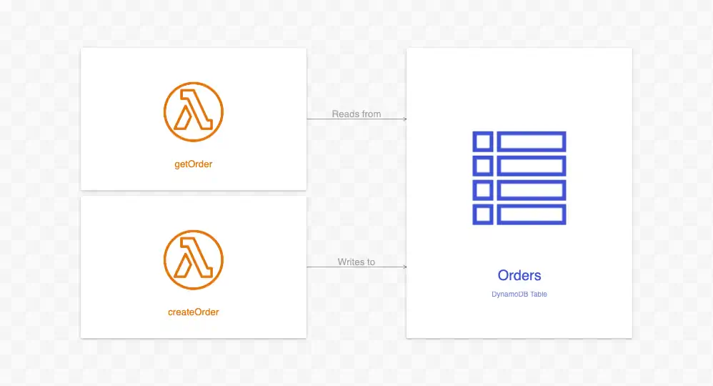
With the addition of createOrder, a pattern has emerged. In the diagram above, viewers can see that getOrder and createOrder are not only similar but also share similar relationships with Orders. Because superior pattern processing is the essence of the evolved human brain, viewers can consume this information in an instant.
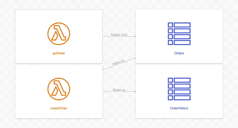
The more resources we add to our diagram, the clearer its patterns become. And with clearer patterns, the diagram’s relative value increases. The diagram above is simple, but the prose translation is getting unwieldy: “There exists Lambda functions getOrder and Orders, and DynamoDB tables Orders and OrderHistory. getOrder reads from Orders, and createOrder writes to both Orders and OrderHistory”.
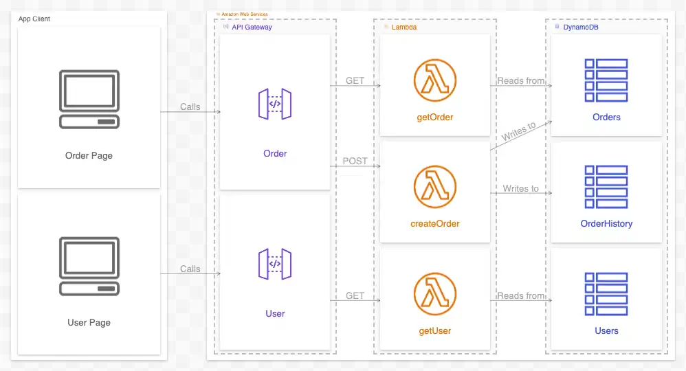
With the addition of more resources and more layers, our diagram is no longer simple. A written description of all these resources and their relationships would be repetitive to read and write.
Furthermore, these new layers introduce transitive relations. For example, there is a direct chain of relations between Order Page and OrderHistory (the DynamoDB table) in the above diagram. This chain indicates that while the page doesn’t write directly to the table, it can do so indirectly. If your diagramming tool is interactive, this can be seen more easily:
Transitive relations are another pattern that is explicit and easily digestible in diagram form. Meanwhile, enumerating all the transitive relations between resources in writing would be prohibitively time-consuming.
Part II: Context
System architecture diagrams have easily recognizable patterns, largely because of their 2D nature. While written documentation must be read in a linear (and, thus, one-dimensional) manner, the viewer of a diagram is free to scan its content in any direction. We can take further advantage of this by adding background context resources to our diagrams that give valuable information to the viewer.
Below is the same diagram from Part I (above), only with additional context added:
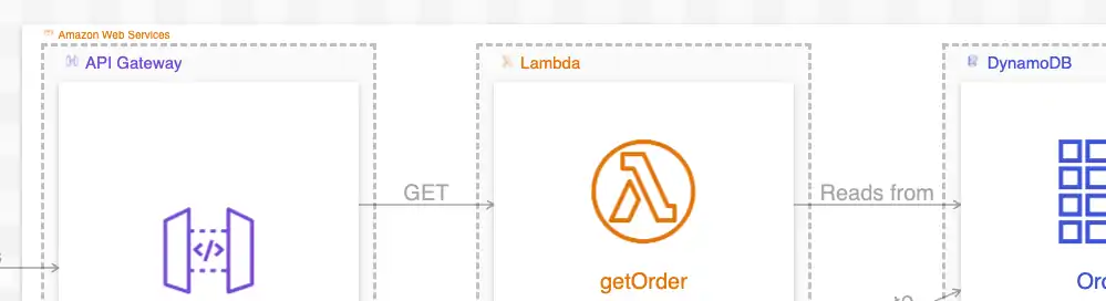
Because it is difficult to see in the embedded image, here is a blown-up view of some of the new context resources:
As mentioned, the relations in this diagram are identical to the diagram in Part I. In that diagram, the resources existed in a void; there was no indication of where they lived or what broader system(s) they were a part of.
In our new diagram, the viewer now has this information. Where each resource appears in the diagram is now highly meaningful. Furthermore, the new context resources give the diagram additional order. This order creates stronger, more easily understood patterns for the viewer.
It’s important to note that while context is a critical element of architecture diagrams, it is not absolute. The same resources and relations of a system can usually be rendered with many different contexts, each of which gives the viewer different information and patterns to consume.
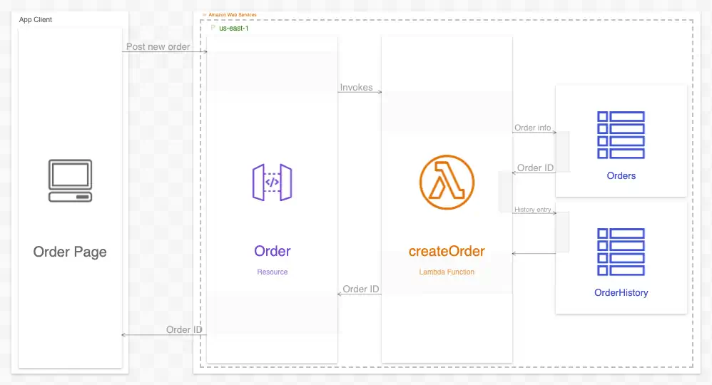
For example, the diagram above shows that our resources span various services (API Gateway, Lambda, and DynamoDB) within a cloud computing platform (Amazon Web Services). Those who use AWS regularly will know that most resources, in addition to being part of a service, also exist in physical locations called regions. We could show the same resources (and relations) in the context of their regions:
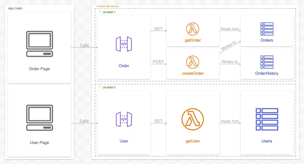
If your diagram tool is interactive, switching between these contexts makes their similarities (and differences) clearer:
Regions aren’t the only other context this diagram could have. If the DynamoDB tables existed in a separate AWS account from the other resources, we could create a new context for this diagram showing that:
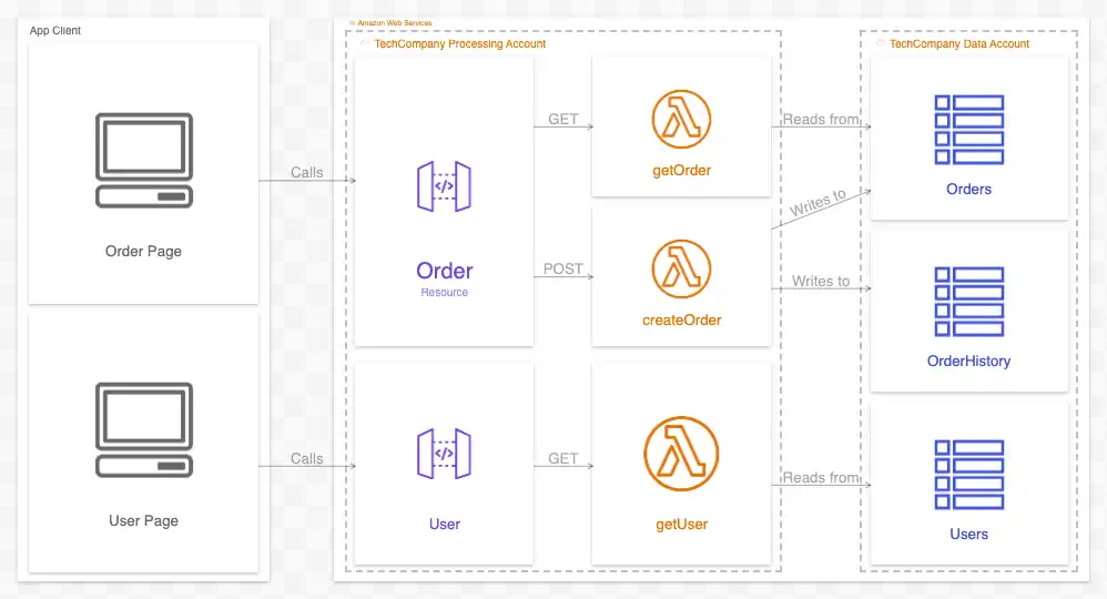
Again, with an interactive diagramming tool, we can switch between these contexts:
In summary, context adds a new dimension to diagrams that tell the viewer about where resources live in the universe. They can also add order to diagrams, strengthening their patterns and, with that, our ease of understanding them.
Part III: Interactions
The diagrams we’ve seen so far have all been relational diagrams; that is, diagrams that show static relations between resources. As the number (and complexity) of those relations grows, the more readable (and thus valuable) the diagram becomes relative to written documentation.
There is a second class of diagrams that documents interactions between resources instead of relations. They are commonly rendered as a sequence diagram like so:
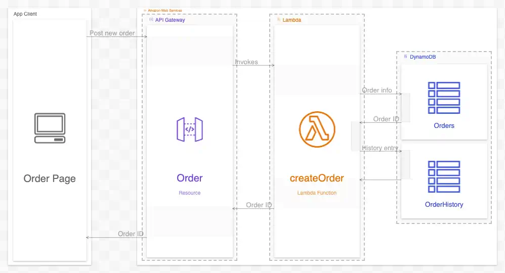
Read from top to bottom, this diagram documents a specific scenario: the Order Page creating a new order. It shows us the steps in this scenario, the resources used, and the order in which they are used. With an interactive tool, we can toggle between relational perspectives and interaction perspectives to compare a resource’s role in different scenarios:
While this information could be conveyed in prose (“First, the Order Page posts a new order to the Order resource. The Order resource then invokes the createOrder Lambda function. That function then…”), it can grow hard to follow quickly. The prose reader also cannot scan the document to recognize patterns like a diagram viewer can.
Furthermore, like relational diagrams, interaction diagrams can convey contextual information more effectively than written documentation. This context can also vary; for instance, here is the same interaction with regional context:
And (more interestingly) here is the same diagram with an account-based context:
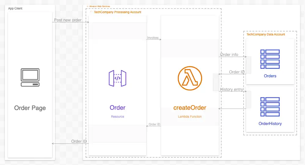
As before, an interactive diagramming tool allows us to switch between them:
Interaction diagrams are powerful tools in a diagrammer’s toolbox. By leveraging the power of pattern and context, the author can convey detailed information about how a system works more naturally than using written documentation alone.
Wrap-up
Architecture diagrams are an ideal medium for documenting the discrete resources of a system, what they are, how they’re related, and how they interact in specific scenarios. By leveraging the brain’s natural ability to recognize patterns, architecture diagrams convey this information easily. To maximize the value of their documentation, engineers should use both written documentation and architecture diagrams to teach others about their systems.
Click here to view the sample diagram used in this article.
Questions or comments? Please reach out to me by email at billy@ilograph.com.